1 Confusion Matrix
The confusion matrix is a useful tool for visualizing the performance of a classification algorithm. In this blog post, we provide a function to generate an image of the confusion matrix. Additionally, the R package caret includes the confusionMatrix function, which produces detailed output.
1.1 Classification
We will conduct a Naive Bayes classification using the classic Iris dataset.
Code
# train and test data
iris$spl <- caTools::sample.split(iris, SplitRatio = 0.8)
train <- subset(iris, iris$spl == TRUE)
test <- subset(iris, iris$spl == FALSE)

iris_nb <- naiveBayes(Species ~ ., data = train)
nb_train_predict <- predict(iris_nb, test[, names(test) != "Species"])

cfm <- confusionMatrix(nb_train_predict, test$Species)
cfm
Confusion Matrix and Statistics
Reference
Prediction setosa versicolor virginica
setosa 10 0 0
versicolor 0 8 0
virginica 0 2 10
Overall Statistics
Accuracy : 0.9333
95% CI : (0.7793, 0.9918)
No Information Rate : 0.3333
P-Value [Acc > NIR] : 8.747e-12
Kappa : 0.9
Mcnemar's Test P-Value : NA
Statistics by Class:
Class: setosa Class: versicolor Class: virginica
Sensitivity 1.0000 0.8000 1.0000
Specificity 1.0000 1.0000 0.9000
Pos Pred Value 1.0000 1.0000 0.8333
Neg Pred Value 1.0000 0.9091 1.0000
Prevalence 0.3333 0.3333 0.3333
Detection Rate 0.3333 0.2667 0.3333
Detection Prevalence 0.3333 0.2667 0.4000
Balanced Accuracy 1.0000 0.9000 0.95001.2 Plotting
To plot the resulting confusion matrix using ggplot, we use the following function:
Code
ggplot_confusion_matrix <- function(cfm) {
  mytitle <- paste("Accuracy", percent_format() (cfm$overall[1]),
                   "Kappa", percent_format() (cfm$overall[2]))
  p <-
    ggplot(data = as.data.frame(cfm$table),
           aes(x = Reference, y = Prediction)) +
    geom_tile(aes(fill = log(Freq)), colour = "white") +
    scale_fill_gradient(low = "white", high = "steelblue") +
    geom_text(aes(x = Reference, y = Prediction, label = Freq)) +
    theme(legend.position = "none") +
    ggtitle(mytitle)
  return(p)
}
Code
ggplot_confusion_matrix(cfm)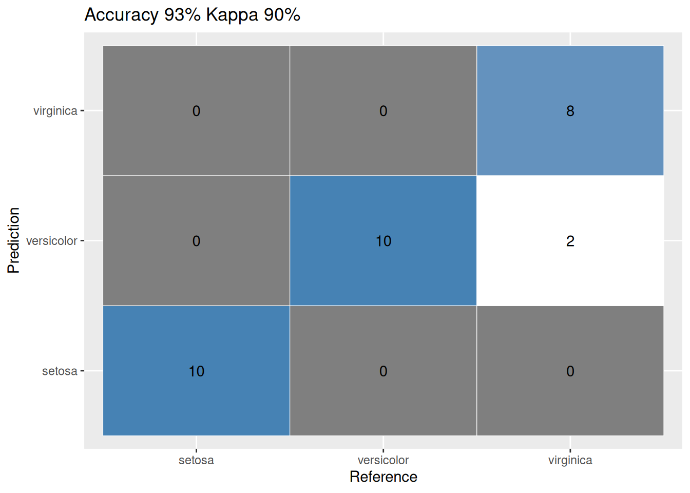
1.3 References
1.
Burns C, Herrero EP (2017) How to produce a confusion matrix and find the misclassification rate of the naïve bayes classifier?, 2017. Available from: https://stackoverflow.com/questions/46063234/how-to-produce-a-confusion-matrix-and-find-the-misclassification-rate-of-the-na%c3%af/46063613#46063613.